ROWDY POPPY
Flowers that Defy Expectations
Rowdy Poppy is a queer-owned and sustainably grown micro farm and floral studio based in Denver. They came to Paper Laundry for fresh branding and help expanding their vision into a physical location. With a steadfast commitment to sustainability and inclusivity, this isn’t your mother’s flower studio. We created a brand that defies expectations while keeping artistry and attitude front and center.
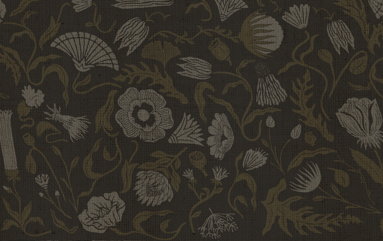
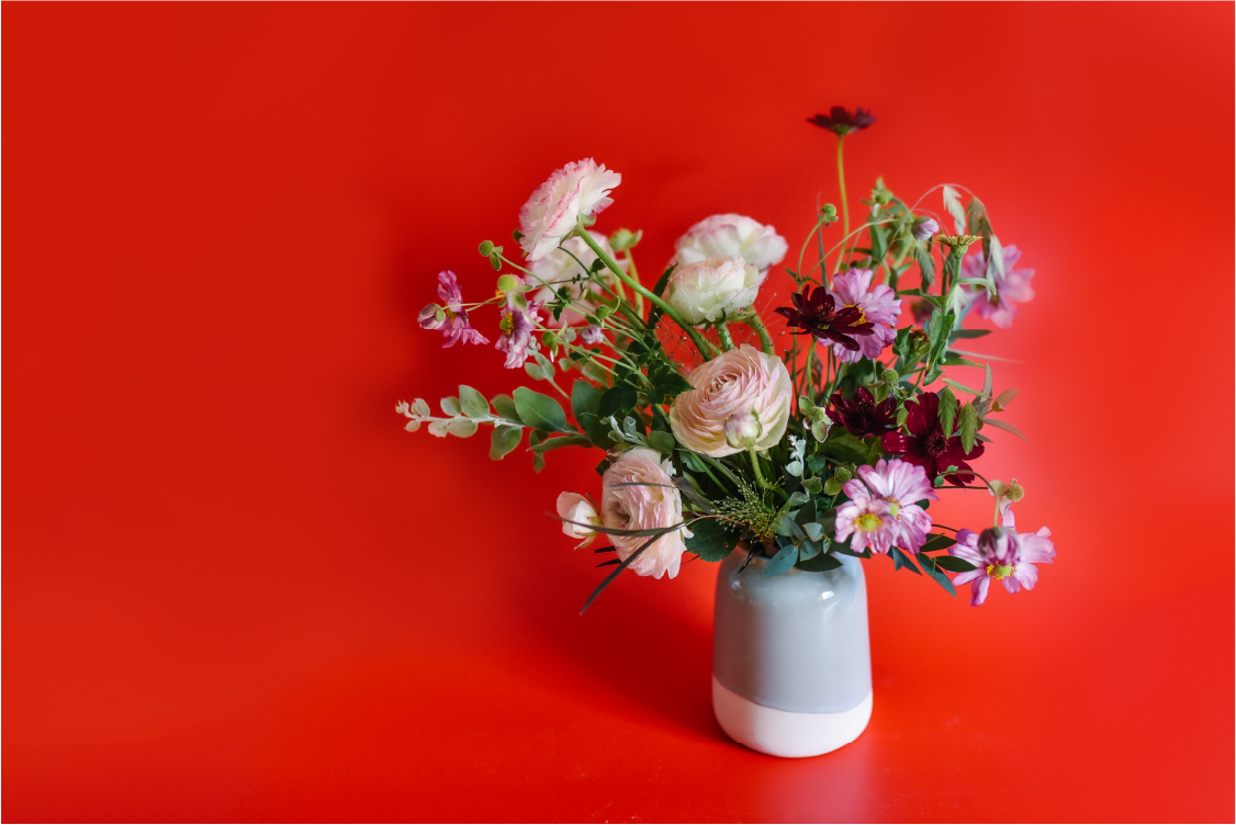
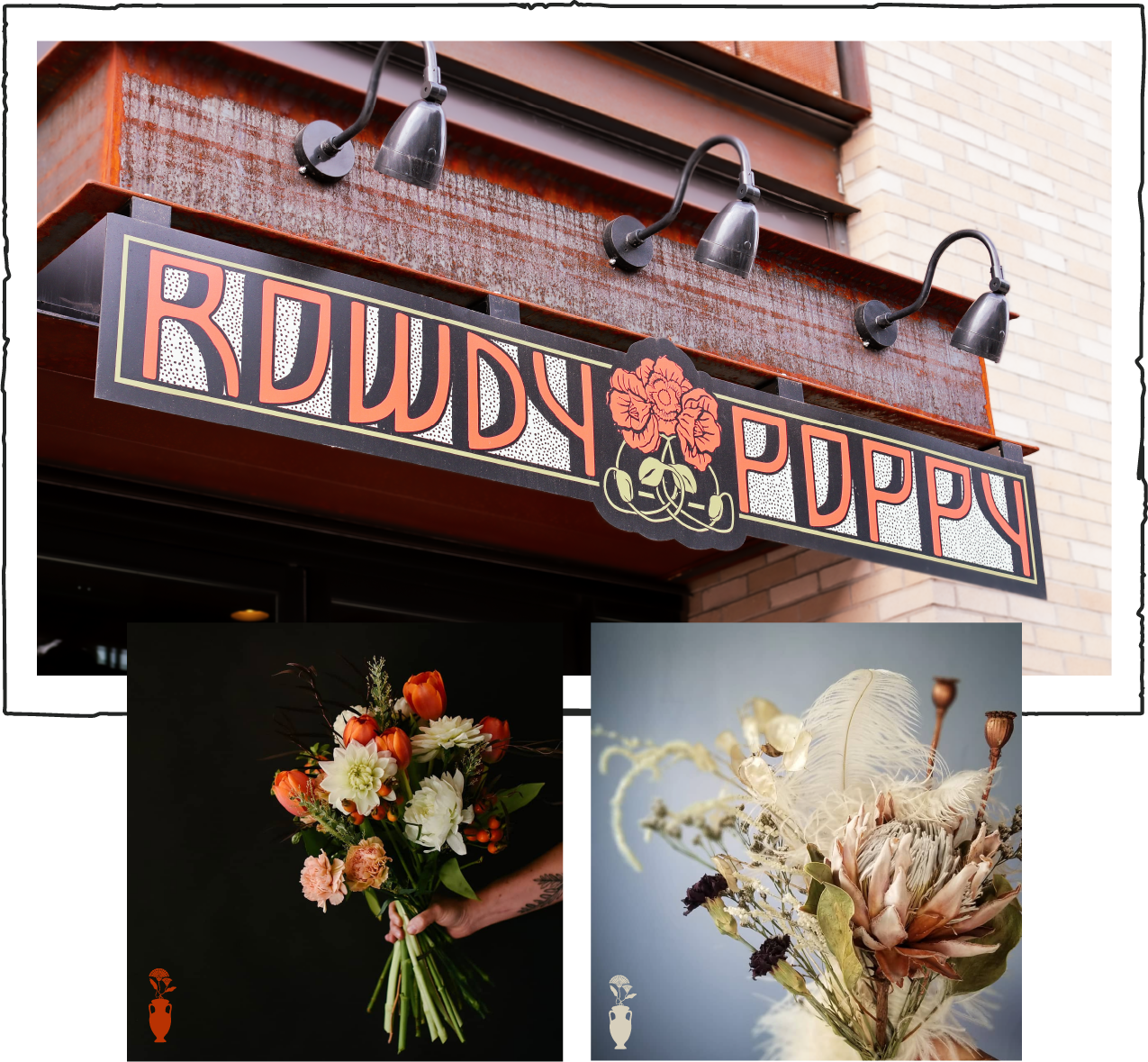
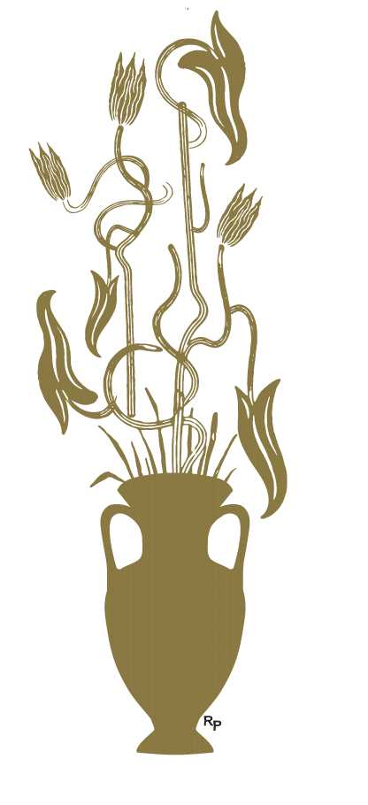
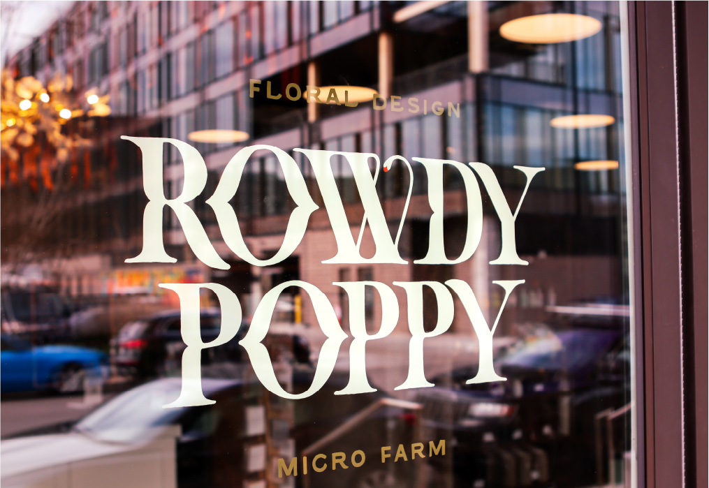
We were inspired by the florals of classic Art Nouveau design — a style that strikes the delicate balance between geometric and organic. A rich poppy-red is at the center of a minimal color palette that doesn’t shy away from darker tones. It all comes together in the signature black vase, the centerpiece of the brand, where floral art and illustrations can switch out interchangeably for a style that always stays fresh.
We helped bring the brand to life in Rowdy Poppy’s new storefront through signage, interiors, and tangible goods such as branded paper wrap and seed packets. The store is now open, and customers can be hands-on with artful arrangements and sustainable stems.
Project
Brand Identity
Logo, Brand Marks, Illustration Palettes, Unique Patterns, Font Palette, Color Palette, Textures, Brand Language
Interior Consulting
Collateral
Packaging
Exterior/Interior Signage + Mural
PARTNERS AND VENDORS
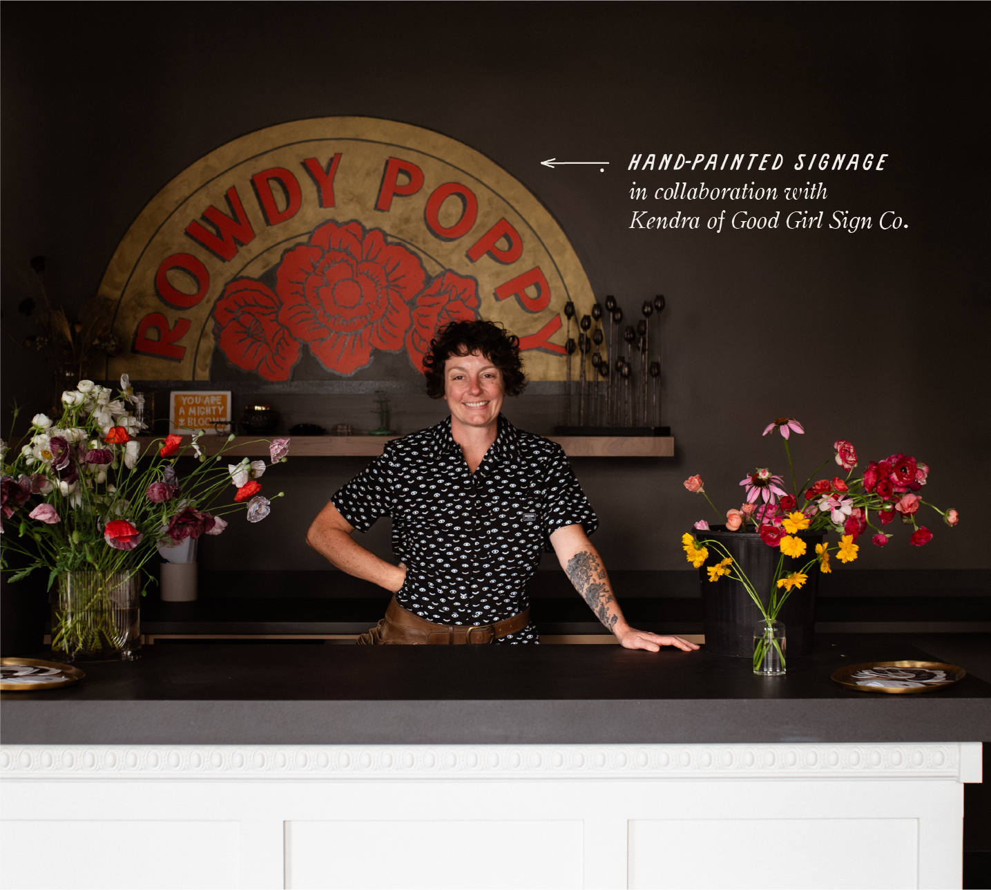
ARCHITECTURE: ARROW B ARCHITECTURE | PHOTOGRAPHY: FRIENDS AND LOVERS PHOTOGRAPHY , HARD KNOCH PR | SIGNAGE: Good girl line & sign co. INTERIOR MURAL: Midnight visuals


Hard Knoch PR


Hard Knoch PR